The Growth360 Dashboard is your command centre – a real-time snapshot of your business performance, pipeline health, and team activity, all in one place.
Note: Access to certain Dashboard components may depend on your user permissions.
Dashboard Management
When you log in to Growth360, the Dashboard is the first thing you see. It displays key metrics through customisable tiles, giving you an at-a-glance view of how your business is tracking.
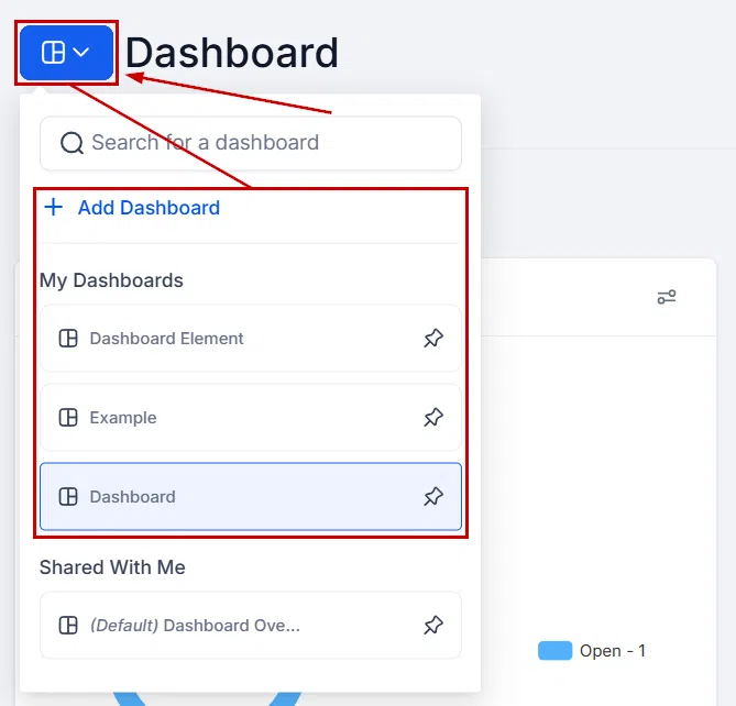
Dashboard Switch
If you have multiple dashboards set up, use the switcher at the top to toggle between them. You can also add new dashboards to create different views for different team members or purposes.

Time Frame
Use the time frame selector to adjust the date range displayed across all your Dashboard widgets. This lets you compare performance week-on-week, month-on-month, or across any custom range.

Customise Dashboard
Click the Edit icon to enter customisation mode. From here you can add, remove, and rearrange widgets to build a view that reflects what matters most to your business. Changes are saved per dashboard.

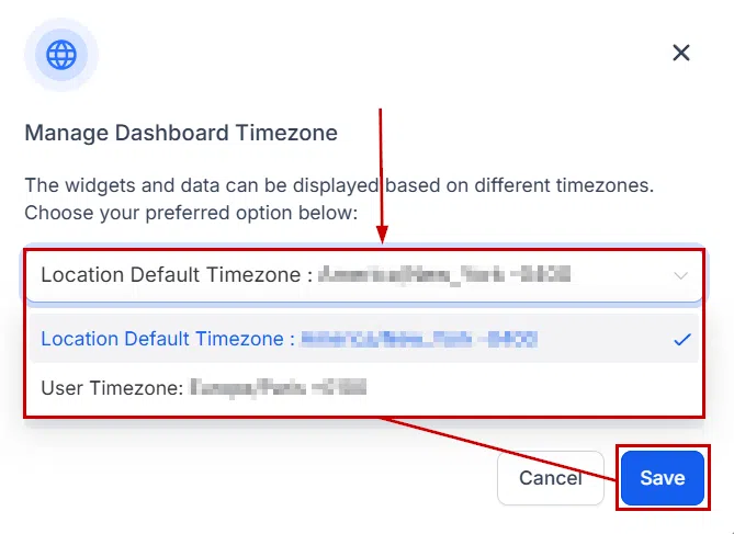
Time Zone
Click the three-dot menu in the top right corner to manage the Dashboard time zone. You can switch between your location’s time zone and your own. The selected time zone applies across all dashboards.

Quick Filters
Quick Filters let you apply temporary conditions to refine the data shown without making permanent changes to your Dashboard layout. Useful for drilling into specific team members, campaigns, or time periods.

Dashboard Data Tiles
Each tile shows a specific slice of your business data. Here are the most common tiles you will see:
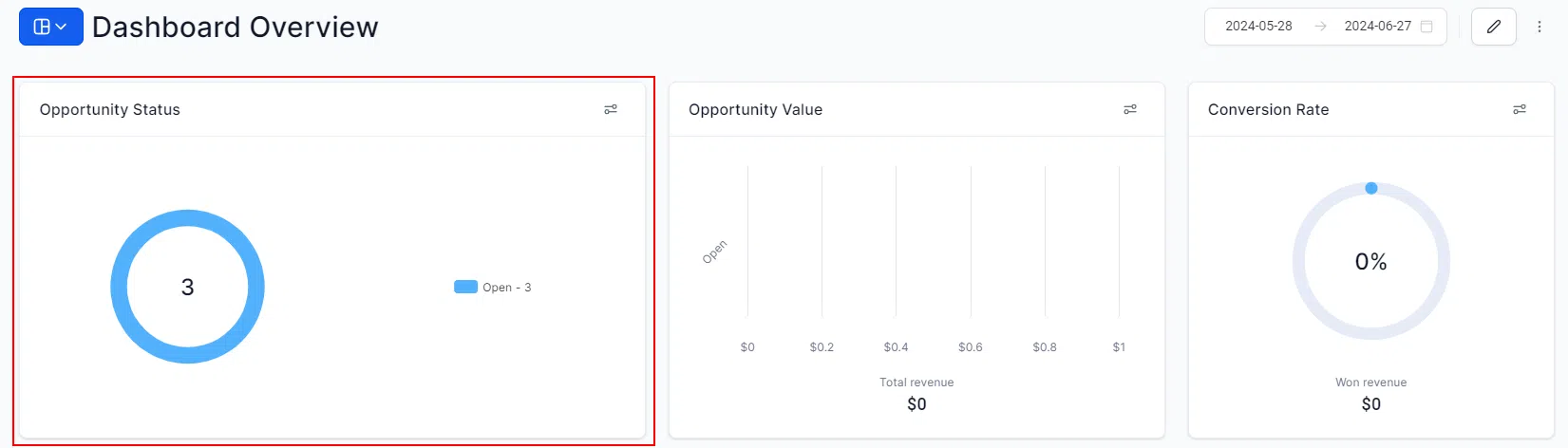
Opportunity Status
Shows the number of opportunities that were open, won, or lost within the selected time period – a fast way to gauge how your pipeline is performing.
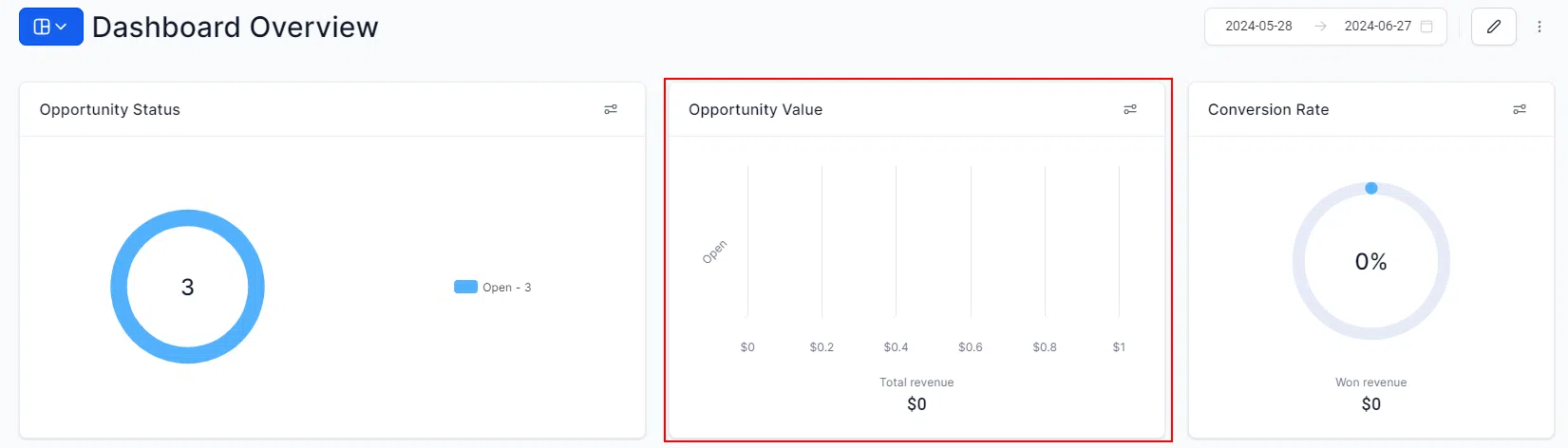
Opportunity Value
Displays the total dollar value of your pipeline, broken down into open, won, and lost amounts. Track how much revenue is in play over any date range.
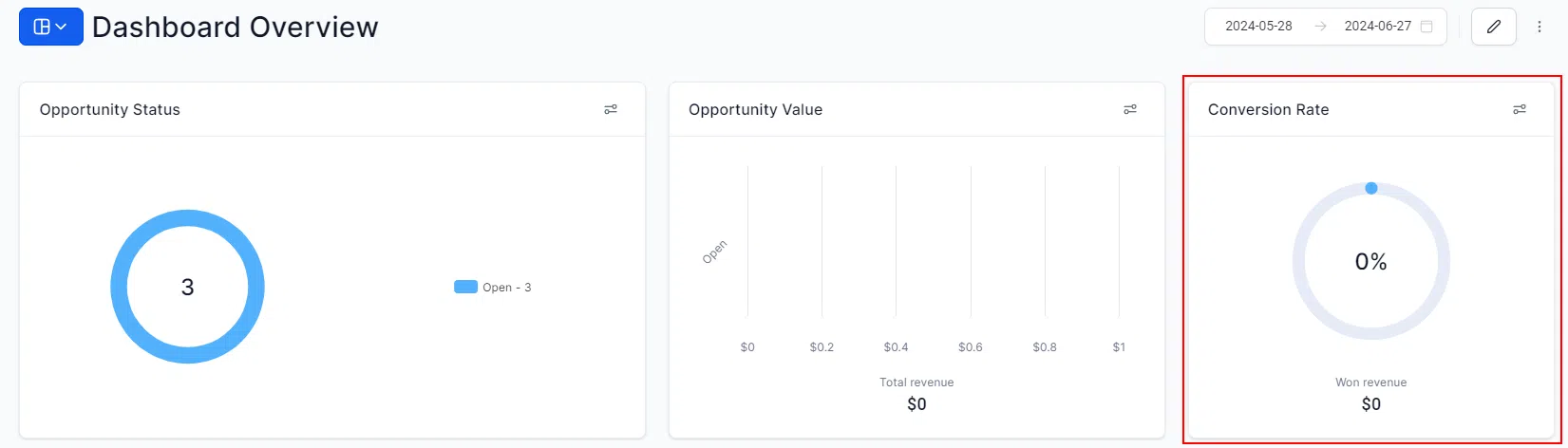
Conversion Rate
Compares won leads to total pipeline leads, giving you a clear read on how effectively your team is converting. Adjust the date range to analyse trends over time.
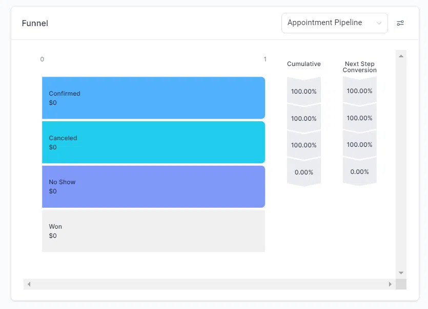
Funnel
Visualises how leads are moving through each stage of a selected pipeline. Shows the number of leads, total value, and percentage at each stage.
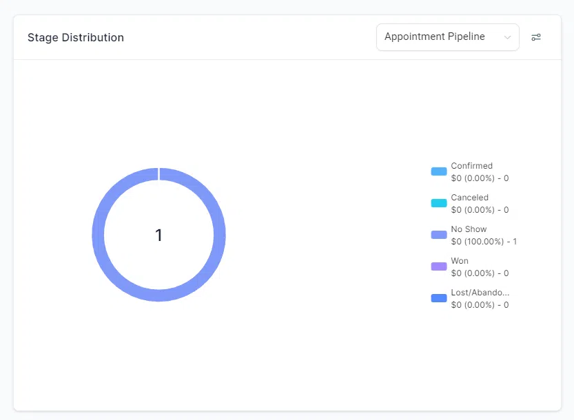
Stages Distribution
A pie chart showing the spread of leads across your pipeline stages. Select a pipeline and date range to see where your prospects are sitting right now.
Manual Actions
Tracks pending manual actions assigned to your team – broken down by calls and SMS. Filter by campaign, workflow, or team member to stay on top of follow-up tasks.

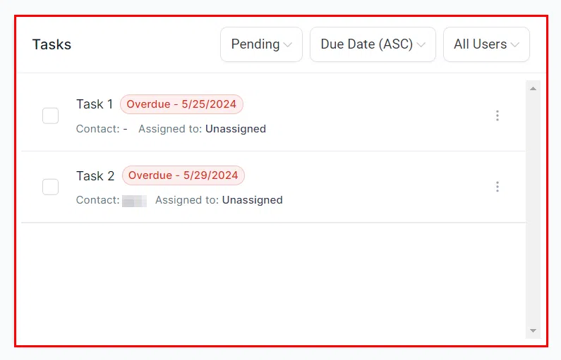
Tasks
View all open tasks or filter by team member and status. Sort by due date to keep track of what needs to be done and what has already been completed.