The Chat Widget settings panels in Growth360 let you control the widget’s appearance, messaging, and chat window behaviour – covering everything from button style and position to contact forms, business hours, branding, and compliance options.
Widget Tab
The Widget tab is where you customise the visual appearance of your chat widget. Open or create a chat widget in Growth360 and select the Widget tab from the left panel to get started.

Chat Prompt
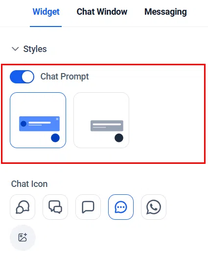
Toggle the Chat Prompt switch to display a message above the chat widget icon. This draws visitors’ attention to the widget and lets them know it is available. You can also choose whether to show the avatar image alongside the prompt.
Icon
Choose an icon that suits the purpose of your widget. You can also add custom icons via the media library by uploading your own image.

Theme
Select a colour theme for the chat widget that aligns with your brand. The theme affects the overall colour scheme of the widget as it appears to your website visitors.

Welcome Message
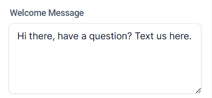
Set a welcome message to greet visitors when they open the widget. A personalised, friendly greeting encourages engagement.
Return Visitors
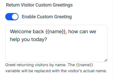
Configure a separate message for return visitors. Acknowledging repeat visitors with a tailored greeting can improve engagement and make them feel recognised.
Avatar
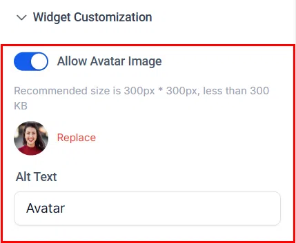
Update the avatar image displayed in the widget. For best results, use an image with dimensions of 300×300 pixels.
Position
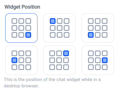
Select where the chat widget appears on the page in a desktop browser. Choose a position that suits your website layout without obstructing key content.
Widget Dimension
Configure the widget’s size. You can set it to adjust automatically based on screen size, or choose a standard size that remains consistent across devices.

Messaging Tab
The Messaging tab allows you to configure the language and content of messages displayed when a chat is ending, update the acknowledgement icon, and adjust the placeholder colour for your widget’s input field.

Acknowledgement (Live Chat Widget)
Expand the Acknowledgement section within a Live Chat Widget to configure the messages displayed at the end of an interaction.

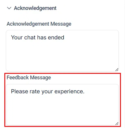
Acknowledgement Message: Enter the text to display when the chat interaction is complete.
Feedback Message: Encourage clients to leave feedback by entering a personalised prompt in this field.
Feedback Submission Note: Add a note that appears after a visitor submits their feedback, confirming their submission was received.

Chat Ended Message: Set the message displayed to visitors when the chat session has been closed.

Acknowledgement Icon and Placeholder Colour: Customise the icon used when sending acknowledgement messages and its background colour. Upload a custom image via the gallery icon.

Contact Settings (SMS/Email Chat Widget)
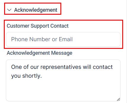
For SMS/Email chat widgets, the Messaging tab includes settings for the contact and message fields shown to visitors.
Message Field: Configure the label and placeholder text for the message input field in the widget.
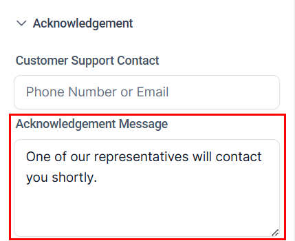
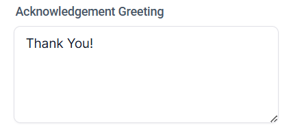
Greeting: Include a warm greeting that precedes the acknowledgement message shown to visitors.
Placeholder Colour: Adjust the background colour of the acknowledgement icon to suit your brand.

Chat Window Tab
The Chat Window tab lets you tailor the chat experience for visitors by customising the messages they see, configuring branding elements, and setting up compliance details to meet legal and regulatory requirements.
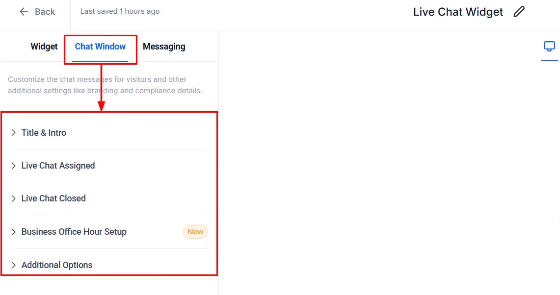
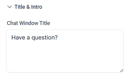
Chat Window Title
Enter the text to display at the top of the chat window. Keep it concise to capture the visitor’s attention quickly.
Intro Message
Specify the initial message displayed once a visitor opens the chat widget. This sets the tone and guides visitors on what to expect.

Contact Form Options
Request leads to provide their contact details the first time they send a message. You can add fields such as name, email, and phone number, and configure which are required.

Button Text: Customise the label on the submit button within the contact form.
Redirect: Optionally redirect visitors to a specific URL after they submit the contact form, such as a thank-you page or additional resources.
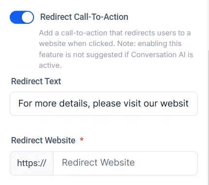
Offline Contact Form
Configure the contact form displayed to visitors when no agents are available. This ensures you continue capturing leads even outside business hours.
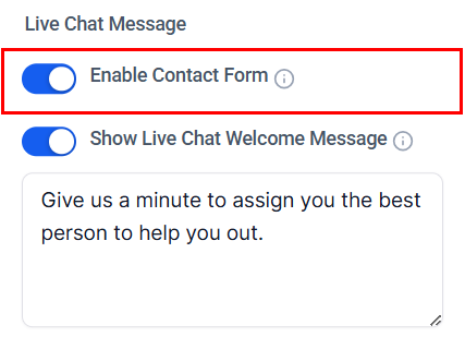
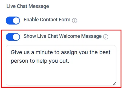
Welcome Screen
Customise the welcome screen visitors see before they begin chatting. This can include a greeting or brief description of the chat service.
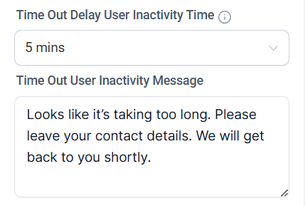
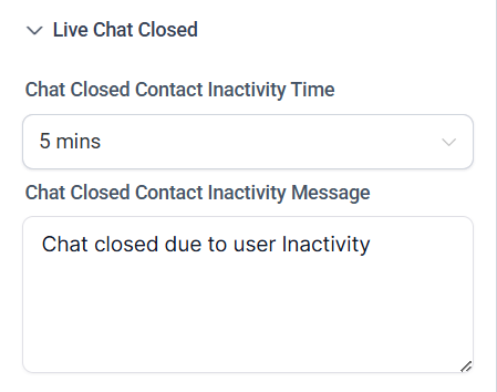
Time Out
Set the inactivity timeout period after which a chat session is automatically closed. This keeps your conversations list clean and ensures resources are not tied up by abandoned sessions.
Chat Closed Message
Configure the message displayed when the chat is closed or unavailable. A helpful message here can direct visitors to alternative contact options.
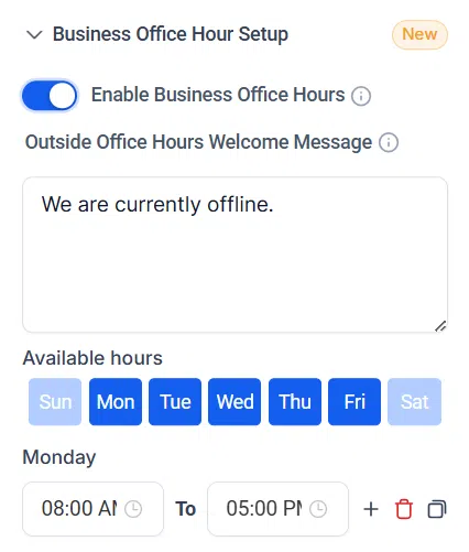
Business Hours
Define your business hours so the chat widget can display appropriate availability messaging. Outside of configured hours, visitors can be shown your offline contact form or a custom message.
Branding
The Branding section allows you to add your company details to the chat widget, ensuring a consistent and professional appearance for visitors.
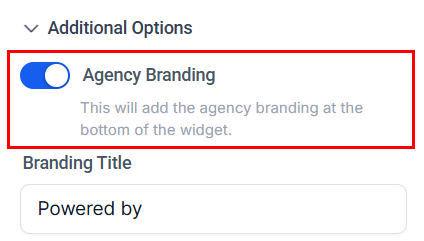
Branding Title: Enter the text that should precede your company’s display name within the chat.

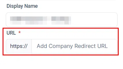
Company Name: Enter the name of your company or entity to be credited in the chat widget.

Company URL: Add a redirect URL visitors can click on the company display name – useful for directing users to your homepage or other relevant pages.
Compliance Settings
HIPAA Consent
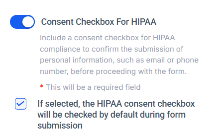
Toggle the HIPAA compliance option to add a consent checkbox to the widget. This ensures visitors acknowledge and consent to the submission of personal information – such as their email or phone number – before proceeding. You can also set the checkbox to be pre-ticked by default.
Legal Message
Optionally include a legal message to inform visitors of important terms, conditions, or privacy policies related to their submission. This ensures transparency and helps protect both the visitor and your organisation.