Project summary
| Website: | LANSW |
|---|---|
| Industry: | Not for profit association |
| Project Scope: | Branding & logo Website design & build |
The challenge
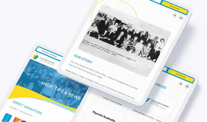
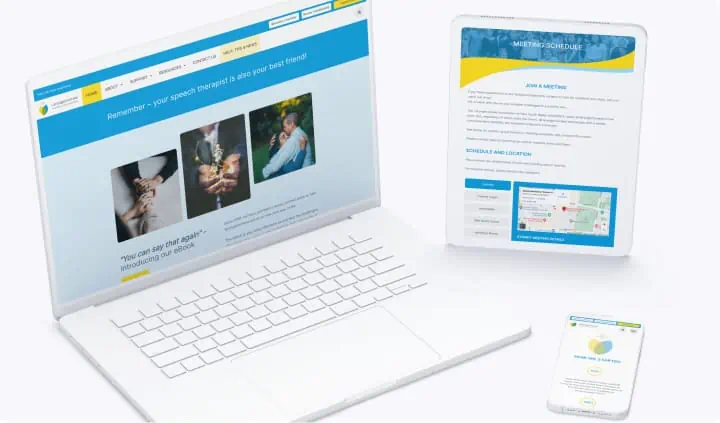
The Larygectomee Associate of NSW is a volunteer run organisation. The previous website contained a lot of great information, however over the years, the structure became hard to follow for new website visitors, making it hard for the information to be found.
Generally – the committee felt that the Association’s brand needed to be modernise to appeal to younger members as the average age of members was rising considerably.
The solution
After spending time with the team at LANSW, we set out to come up with a brand and logo that had meaning to the association and its members, and to be fresh and inviting.
- Tulip – which represents love, warmth and perfection.
- Yellow – hope, optimism, energy and typically used to highlight communication
- Blue – strength, intelligence and calming (and represents the throat area in Chakra)
- Green – healing, good health and a healthy lifestyle
The design and structure of the website expanded on these themes, with the overarching principle that the website should be welcoming and suggestive in nature, rather than directive.


Thank you MWA, you are the best!
From our first contact with Laetitia, communication was prompt and welcoming. Her insight and experience enhanced our information into a useful resource that will benefit Laryngectomees for years to come.
Nigel – Secretary LANSW